
Article
Patient Engagement & UX for Bluetooth Medical Devices
This post was previously on the Pathfinder Software site. Pathfinder Software changed its name to Orthogonal in 2016. Read more.
Many large e-commerce sites work beautifully as long as users do what they’re supposed to. The minute users make mistakes, however, the UxD falls apart completely. Case in point: Amtrak‘s online checkout process, in which poor choices about error handling can make it a real hassle to check out successfully.
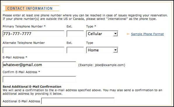
Amtrak’s first mistake was to create an email address verification field. Plenty of usability experts have decried this silly device for encouraging error-free user input. The annoyance would be minor, however, if Amtrak at least auto-filled the email verification field for returning visitors. It doesn’t. When you log into an existing Amtrak account and try to purchase, your address is auto-filled in the main email field, but it’s not auto-filled in the verification field. Because there’s only one field in the entire “Contact Information” section of the page that doesn’t get auto-filled, it’s easy to breeze pass and not realize that input is required. You go on to enter your credit card information and click “purchase,” only to end up with an error. Until recently, that error wasn’t caught by any client-side validation, so you had to wait for a round trip to the server before being notified. Recently, though, the interface has been updated so that you get a 1999-era JavaScript popup telling you to fill in all required fields. It’s nice that Amtrak at least reduced the annoyance of this bug, but why not just fix the root problem by either getting rid of the email verification field altogether or auto-filling it for returning customers?
Amtrak’s second mistake was not to persist credit-card verification code values across the session. When you encounter an error during purchase and get sent back to the checkout page, your previously entered three-digit credit CCV code gets blanked out. Until recently, the blanked-out CCV field wasn’t signposted at all. The user would submit the checkout form, get bounced back to it for an unrelated error, fix that error, submit the form again, and get bounced yet again, this time for a missing CCV field. Again, somebody at Amtrak appears to be working through these problems. Now, any time a user gets bounced to the checkout page, the CCV field gets highlighted in red to alert the user that it’s been blanked out. As with the earlier fix I described, though, this treats only the symptom, not the problem. The user is in an SSL session, so why not just persist the CCV value in the first place?
Amtrak’s final and most vexing mistake hasn’t been fixed yet, and this one’s a doozy. When you end up on the checkout page in an error state, Amtrak obfuscates your previously entered credit-card number by displaying all but the final four digits as a series of hashes. Yet the server code doesn’t persist the actual value for your credit-card number. You end up in an error state, fix the error, re-enter your CCV number and click “purchase.” Boom, you’re back on the checkout page with a message that your credit-card number is invalid. What kind of madness is this? If you don’t want to display the user’s credit card number in your markup and can’t – for some unfathomable reason – write code that maintains the value on the server, then why not just blank out the credit-card field altogether – just as you’ve done with the CCV field? Highlight it in red and let the user know she needs to re-enter it.
All of these isolated mistakes wouldn’t be so aggravating if they didn’t all feed into one another. Users hate nothing worse than a checkout process that goes around and around in circles, presenting them with a new, totally unrelated error on each rotation. User-experience design should treat error states with the same care as other stages in the user flow. Once a user encounters an error, your application should bend over backward to help him recover completely on his next attempt.
I can only assume that Amtrak has a front-end team that’s tasked with improving usability, yet has no authority to update the server-side code. Rather than being empowered to fix a problem, they have to patch over it on the UI side. As a long-time UI engineer, I’ve seen this sort of thing happen time and again at big companies. That’s probably why the bug with the obfuscated credit-card number hasn’t been addressed; it’s the kind of thing a client-side developer simply wouldn’t be able to fix without the intervention of a back-end developer. Isn’t siloed development great?
It’s nice to see that Amtrak has taken some steps to clean up its checkout experience since I wrote the original draft of this post a couple of months ago. But a complete usability review would probably help the rail carrier fix its remaining UI problems, and a better-integrated development team would be able to fix problems at their root. In the meantime, I salute what I imagine to be a lone front-end person fighting valiantly for Amtrak’s end users one little client-side band-aid at a time.
Related Posts
Article
Patient Engagement & UX for Bluetooth Medical Devices

Article
How Design Can Improve Ratings for Medical Device Apps

Article
5 Keys to Integrating UX Design With Agile for SaMD

Article
Accelerate Your SaMD Pipeline with Product Analytics
