
Article
Patient Engagement & UX for Bluetooth Medical Devices
This post was previously on the Pathfinder Software site. Pathfinder Software changed its name to Orthogonal in 2016. Read more.

Heuristic reviews are a great tool for finding usability issues in any existing interface, from web-based to desktop. It’s a quick and relatively inexpensive way to uncover, document and prioritize usability problems.
From usability.gov:
The goal of heuristic evaluation is to find usability problems early in the design of a Web site so that improvements can be made as part of the iterative design process … The result of this analysis is a list of potential usability issues or problems.
While I use heuristic reviews and find the results to be very helpful, I’ve never been too thrilled with the final documentation. Even when formatted nicely, they’re nothing more than a laundry list with a bunch of words and numbers and no hints or ideas on how that information can be grouped together and translated over to an application. Quite frankly, after the second page, my eyes do tend to glaze over. And if my eyes glaze over, I can’t even imagine how it affects the client. So I was challenged to come up with something better.
My co-worker, John McCaffrey, wanted to give his client some ideas on how to improve their site — a heuristic review but with a sort-of Cliffs Notes component that could highlight the value of the review but not induce eye fatigue. He was also looking for something more visual to grab the interest of the client and keep them there long enough to start looking at the data. He mentioned that he really likes our annotated wireframes and an idea was born. Create a mashup of annotated wireframes and heuristic evaluation.
Our clients love annotated wireframes. Our developers love them as well. And what’s not to love? A quick glance lets you see the proposed solution and the page notes describe the interaction details. With combining the two documents into one (wireframe + review), the resulting graphic identifies the areas on the screens that the review data highlighted. The result? a visual heuristics.
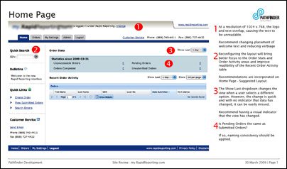
Here’s what I did: For the major screens, I created a page and highlighted some of the issues uncovered in the review that were pertinent to that screen. I added the relevant heuristic data points along the side and referenced a marker on the page that related to a particular point. At a glance, the client can see the relationship between what the review uncovered and where it shows up in their application.
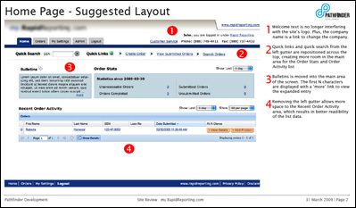
Because we design software, I then took the additional step of creating a mock-up of a proposed solution. This view shows how that same screen could be revised to solve the problems highlighted on the previous page. It’s not adding any new features, but rather taking the heuristic review and showing the client some suggestions on how the gathered data could be implemented. The client can easily compare the “before” and “after” shots, draw their own conclusions (do we need it or not) and better evaluate the implementation effort vs. business payoff.
Or, as John put it:
Brilliant!!!! It has such a tangible feeling, and it makes it easy for [the client] to say “Yes, I want that. Give me that right now!”, whereas all the words that we had spewn out in our other document, while trying to highlight some of the same areas, just didn’t have the same punch. Yay visual communication!
Yay visual communication indeed.
Related Posts
Article
Patient Engagement & UX for Bluetooth Medical Devices

Article
How Design Can Improve Ratings for Medical Device Apps

Article
5 Keys to Integrating UX Design With Agile for SaMD

Article
Accelerate Your SaMD Pipeline with Product Analytics
