Article
Patient Engagement & UX for Bluetooth Medical Devices

by Aaron Sutton and Bob Moll
Illustrations by Izzy Hall
In UX design we’re taught to reduce friction: the tendency of the design to slow the user down. But think about walking outside in winter (okay, let’s say a Chicago winter, when it gets cold) and walking over a patch of ice. Your sudden near-frictionless experience can result in a fall and even injury. Could the same happen in the UX design of a medical device?
It could, and arguably did, to one of our software engineers who had to take a test for sleep apnea. Such tests are meant to analyze irregularities in breathing patterns during sleep, and they are often done in the home with a kit and an app supplied by the physician.
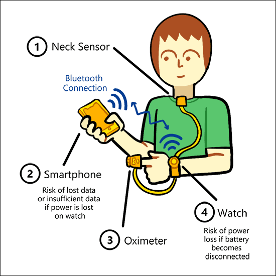
Our engineer, we’ll call him Mike, received a sleep test kit with a watch, an oximeter and a sensor/microphone to attach just below the neckline. The device was battery powered and required a AAA battery. Mike then downloaded the companion app and paired it with the device over Bluetooth.
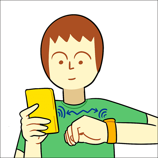
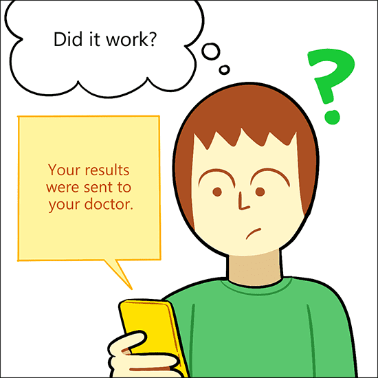
Next, Mike entered the 4-digit PIN supplied by the physician and then pressed the “Start Recording” button. A timer started on the screen but there was no other visualization or messaging. He went to sleep thinking everything was fine.
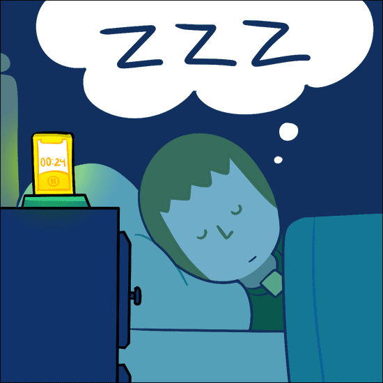
Next thing he knows he wakes up in the morning. Mike tries to stop recording, but the app complains that it can’t use Bluetooth to find the watch. He notices the device is off, and the battery is slightly out of place. He removes the battery and puts it back in. The app uploads with no explanation or warning, just a message saying, “Your results were sent to your doctor.” No other options or visualizations were provided by the app. On the surface, it seemed like the system worked.
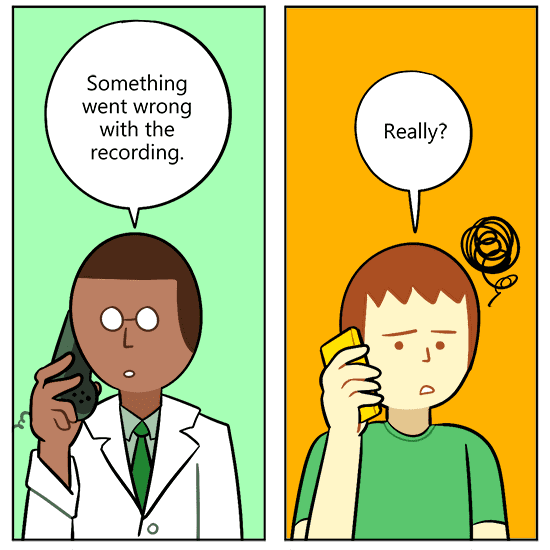
However, later that day the doctor called Mike to let him know that the device only recorded data for a short period of time and then stopped. The test was of no value, but the only way Mike found out something went wrong was to have the physician look at the uploaded data, or lack thereof.
The sleep apnea system knew it didn’t have enough data for a valid test. It ideally should have informed the user of this, and even better, if it could detect the loss of battery on the device, inform the user of that too. That would reduce the risk that poor data was uploaded and converted into a diagnosis.
The system was too frictionless. Some ideas to fix that come to mind. For example, the app could have contained some messaging at each step of the process and even reminded the user to check the installation of the battery. While the process is fairly simple, things can go wrong. The app flow needs to anticipate this and offer mitigations along the way.
There are several UX best practices that could have helped design a better sleep apnea test device:
If something on the device goes wrong (like no battery), the app needs to know. Perhaps even more importantly, the user needs to know so the problem can be fixed or the test aborted without risk of erroneous results being uploaded.
The happy path in a system is usually easy to come up with. But how do you derive the edge cases? We recommend starting with a user flow for the entire system and then performing a preliminary hazard analysis (PHA). In the PHA, you identify hazards, hazardous situations and harms that can occur at every bend and twist of the user flow.
You must take the time to let your user know what is happening. In the sleep apnea system, the start button could have had some labeling that informed the user to start the timer when ready to go to sleep. Then while the timer is going, if the device loses power, the app needs to know and at least leave a message for the user to see in the morning when he wakes up.

As Principal UX Architect, Bob directs user experience and human factors initiatives for Orthogonal’s SaMD projects. He oversees user definition, use environment analysis, user workflow modeling, and interface design and development for FDA in an agile environment. Over the past two decades, Bob has worked with a range of enterprises, from Fortune 500 companies to innovative startups, designing successful new products from scratch and reenergizing existing products with improved user experiences. Bob has served clients and a wide range of their users in the financial services, education, and medical design spaces.
Aaron is a Software Engineer who builds web applications for Orthogonal’s clients.
Izzy Hall is a Content Writer and Strategist at Orthogonal. They are also a cartoonist. Izzy has contributed writing, editing and graphics to Orthogonal’s new website and Insight blogs.
Related Posts
Article
Patient Engagement & UX for Bluetooth Medical Devices

Article
How Design Can Improve Ratings for Medical Device Apps

Article
5 Keys to Integrating UX Design With Agile for SaMD

Article
Accelerate Your SaMD Pipeline with Product Analytics
